How to get here
Tools menu > Control Centre > Advanced > Look & Feel.
From this page you can add, remove and edit 'look and feel' templates. Each template will determine the font (typeface), colour and style used for text used throughout Lab Manager, as well as the sizes of various aspects of the interface such as the toolbar size.
The current user will need to have Advanced control level to access this page.
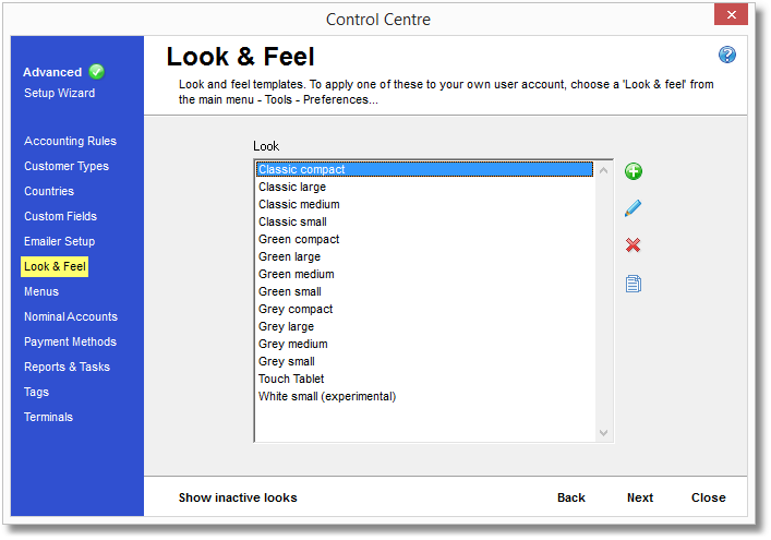
Look and feel templates
All available templates are listed in the main part of the form. Each one of these templates stores settings for font styles and colours and dimensions of various interface elements. Highlight one of these templates (by clicking it with the mouse) and edit or delete it by using the buttons on the right side of the panel.
 Add New
You may wish to refer to the User Interface help page for help identifying the interface elements described below.
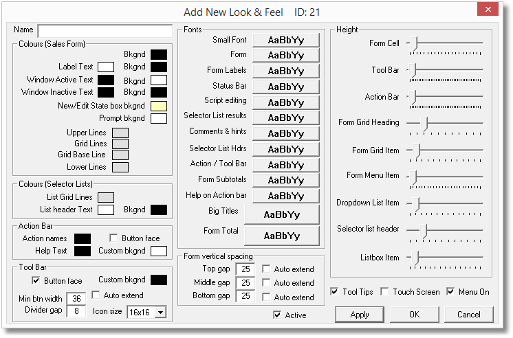
Clicking Add New (or Edit) will present you with the panel shown above.
| • | Name is a name associated with this template for reference. |
| • | Colors (Sales Form) controls the colours used on various parts of the main form: |
| o | Bkgnd - The background of the main form, on which all the other text, data and columns sit. |
| o | Label Text - All text 'labels' on the main form, such as "Customer", "Job #" and the column headings. |
| o | Label Bkgnd - The background of all text 'labels' on the main form. |
| o | Window Active Text - The text of all data areas, when creating a new job or viewing a job in an Edit state. eg. the contents of the line item area. |
| o | Window Bkgnd - For a new job, or a job in an Edit state: The background of all data areas, such as the contents of the line item area or the Customer details boxes. |
| o | Window Inactive Text - The text of all data areas, for jobs that are already Booked In/Out. eg. the contents of the line item area. |
| o | Window Inactive Bkgnd - The background of all data areas, for jobs that are already Booked In/Out. eg. the contents of the line item area. |
| o | New/Edit State box bkgnd - The background of the State box when creating a new job or editing an existing job. |
| o | Prompt bkgnd - The background of the currently selected box on the main form. |
| o | Upper Lines - The border lines between data boxes in the upper part of the screen, such as between "Bill To" and "Customer". |
| o | Grid Lines - The vertical lines between columns in the line items area. |
| o | Grid Base Line - The border line on the lower edge of the line items area, above the "TOTALS" row. |
| o | Lower Lines - The border lines between data boxes in the lower part of the screen, such as around the "Note" box. |
| • | Colors (Selector Lists) controls the colours used in selection list dialogs: |
| o | List Grid Lines - The vertical lines separating columns in selector list dialogs. For example, Customer menu > Select or Add New. |
| o | List header Text - The column header text on selector list dialogs. eg. "FullName" or "DeliverTo" headings in Customer menu > Select or Add New. |
| o | List header Bkgnd - The background of column headers on selector list dialogs. eg. the colour behind the column header text in Customer menu > Select or Add New. |
| • | Action Bar controls the properties of the area at the bottom of the main form where helpful text and available actions are displayed: |
| o | Action names - The colour of the text on the Action buttons |
| o | Button face - toggles the Action Bar between a flat colour (defined by the Custom bkgnd, below) or a Windows button style. |
| o | Help Text - the colour of the short, helpful text that appears in the Action Bar. |
| o | Custom bkgnd - the background colour of the Action Bar when Button Face isn't ticked. |
| • | Tool Bar controls the horizontal strip of buttons along the top of the main form, below the menu bar: |
| o | Button face - toggles the Tool Bar between a flat colour (defined by the Custom bkgnd, below) or a Windows button style. |
| o | Custom bkgnd - the background colour of the Tool Bar when Button Face isn't ticked. |
| o | Min btn width - the width used for each button on the Tool Bar. This will determine the horizontal spacing between the buttons. |
| o | Divider gap - the space used either side of a divider line on the Tool Bar, such as between the Jobs search button and the Navigation Controls. |
| o | Icon size - the size of the icons used, in pixels. Select between 16x16 (smallest), 20x20, 24x24 and 32x32 (largest). |
| • | Fonts controls the fonts (text styles) and text sizes used throughout Transactor Lab Manager: |
| o | Small Font - Any area where very small text is appropriate. |
| o | Form - Text on the main form, such as the client name, job status and the line items associated with a job. |
| o | Form Labels - On the main form, the column headers and field names, such as "Client", "Bill To" and "Details". |
| o | Status Bar - The text used for the page list down the side of the Control Panel, as well as most of the text and list boxes used within the Control Panel. |
| o | Script editing - For technical access only. |
| o | Selector List results - The text shown vertically in columns in selector list dialogs, such as Customer menu > Select. |
| o | Comments & hints - Help text that may be displayed throughout the software. |
| o | Selector List Hdrs - The text at the top of each column in a selector list dialog, such as "FullName" or "DeliverTo" in Customer menu > Select. |
| o | Action / Tool Bar - The text in the Action Bar and Tool Bar, such as the prompts to press F3 for a New Job, or F12 to Clear. |
| o | Form Subtotals - The Net and VAT subtotals shown near the bottom of the main form. |
| o | Help on Action bar - The helpful text that appears in the Action Bar along the bottom of the main form. |
| o | Big Titles - Used wherever larger text is required for titles, such as the text at the top of a page in the Setup Wizard. |
| o | Form Total - The grand total figure, shown at the bottom right of the main form. |
| • | Form vertical spacing determines the amount of vertical space between the three different areas of the main form. |
| o | Top gap - The space between the bottom of the Tool Bar and the top of the first set of boxes on the main form, in pixels. |
| o | Middle gap - The space between the bottom of the Job Details area of the main form, and the area containing the line items, in pixels. |
| o | Bottom gap - The space between the Totals area and the bottom of the main form, in pixels. |
| • | Active denotes if this template is available for use or is in an inactive state. Inactive templates are not deleted but will only show in the Look and Feel list when the "Show Inactive |Looks" button is clicked. (see below) |
| • | Height determines the height of various components around Lab Manager. These are all controlled by a slider bar that you can click and drag with the mouse to alter the size of the component, with smaller (shorter) values being to the left of the bar and greater (taller) values being to the right. Each bar is divided into pips which represent a valid position for the slider - some bars have a larger range of positions available than others. |
| o | Form Cell - The size of the individual cells on the main form, such as each box in the Job Details area, or the Totals boxes. |
| o | Tool Bar - The height of the Tool Bar. |
| o | Action Bar - The height of the Action Bar at the bottom of the Lab Manager screen. |
| o | Form Grid Heading - The height of the header row on the line item area of the main form. |
| o | Form Grid Item - The height of each row in the Line Item area of the main form. |
| o | Form Menu Item - The height of each item in the menu |
| o | Dropdown List Item - The height of each row in a drop-down list, such as the Usual Prices box of the Customer dialog. |
| o | Selector list header - The height of the header row in selector list dialogs, such as Customer menu > Select. |
| o | Listbox Item - The height of individual rows in the results of a selector list dialog, such as Customer Menu > Select. |
| • | Tool Tips toggles whether tool tips should be displayed when the user hovers their mouse pointer over a control. |
| • | Touch Screen toggles whether a touch screen is being used, where the user may control Lab Manager by pressing on the computer screen with their finger. |
| • | Menu On toggles the Menu Bar along the top of the screen on or off. If you are using Lab Manager with a hand-held device you may find you do not use the Menu Bar and turning it off will give you a little more vertical space on your screen. |
 Edit currently selected template
Clicking the "Edit" button or pressing the Spacebar will allow the user to make changes to the template currently selected in the list. The same window will appear as for Add New (above) but will show the properties of the currently selected template.
 Delete currently selected template
Clicking the "Delete" button or pressing the Delete key will prompt the user if they wish to delete the template currently selected in the list. Upon confirming this action the template will be permanently deleted. If you would rather deactivate a template so that it can't be used until reactivated again, you can edit the template (as above) and clear the check mark in the "Active" box.
 Copy to New
You can create a new template based on an existing one if you need to duplicate some of its properties. Clicking this button will create a new template with the properties of the template currently selected in the list, and show the same window as for Add New (above).
You should give this new template a new name by changing the contents of the Name box. The new template will not allow you to save it (using the OK button) until you have given it a new name.
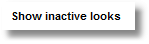
By default, only active templates are listed on the Look and Feel page. Any templates that have been marked inactive (the "Active" box on the template's properties has been cleared) can be viewed by clicking the "Show Inactive" button. To return to active templates click the "Show Active" button.